 In this project, second graders took inspiration from Jasper Johns and created work using familiar characters. If you look closely at this painting, you can see Johns used numbers. In their own work, second grade artists explored creating a painting with the alphabet.
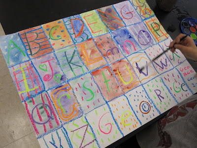
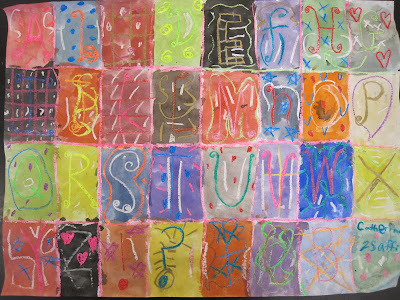
Second grade artists have been experimenting with watercolor resist, as you saw in their monster portraits. Students began by folding their paper into 32 boxes. Next, they used oil pastel to add one letter to each box. They were encouraged to experiment with the size of their letter and the style they wrote it in. Next, the artists used a different color to create a pattern behind each letter. We remembered that a pattern is made when a color, line or shape is repeated again and again.
 After they had completed all of their boxes, including the six "bonus boxes" at the end, students added watercolor over their drawings. We discussed how certain colors contrast and make others stand out. Students noticed that this was especially true when they used a very dark paint over light drawing.
The result is really interesting. In some pieces, the alphabet is very clear. In others, it takes a minute to recognize the letters. Either way, they came out great!
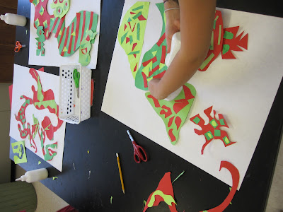
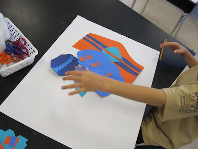
 Third grade students have been studying shape and color. For this project, we were inspired by the work of Elizabeth Murray. To begin, we learned about organic and geometric shapes. Artists noticed that organic shapes often have curved and irregular sides and geometric shapes are shapes that we recognize (square, triangle, rectangle, etc.). Next, we learned about complementary colors. Complementary colors are across from each other on the colorwheel. When you put two complementary colors next to each other, they become vivid and stand out. Students were asked to create organic shapes out of construction paper. Once they had their shape, they used the complementary color to create patterns on top with collage. Students made a number of shapes using the same pair of complementary colors.
 Next, we looked at the work of Elizabeth Murray. Students noticed how she put many shapes together into one composition. We also noticed that new shapes were created in the space between the colored shapes. This is called negative space. Students took all of their shapes and played with their own composition. They experimented until they made a piece that had interesting positive and negative space. Once they were finished, they glued their shapes to large pieces of paper.
 Check Digication for more finished pieces in the coming week.
Breaking News! I am the guest blogger for the month of November on From Studio to Classroom, an excellent blog about contemporary ideas in art education. Check it out!
Later this week--kindergarten ceramics, first grade jungles, second grade alphabet drawings, third grade collages and fourth grade cardboard relief explorations.


 The following class, students added warm colors. They used these to add flowers and animals to their jungle scene.


